I shipped a fully responsive website with complete visual identity, from initial design through implementation, using AI tools to accelerate prototyping and development. This established SUPA's digital foundation and helped 200+ psychology students discover resources and connect with their community.

Product Design
User Research
Web Development
Personal Project
Figma
HTML/CSS
Aug 25 - Jan 26
(5 weeks)
Stanford Undergraduate Psychology Association (SUPA) serves as the main student organization connecting psychology undergrads to each other, faculty, and the department. With hundreds of students interested in psychology, they need a strong digital presence to communicate events, resources, and building community.
Without a proper website, unlike other major organizations like Stanford Symbolic Systems Society and Stanford Undergraduate Neuroscience Society, SUPA lacked visual and digital foundations.
This created barriers to community building, as students had no central hub to discover events, access resources, or connect with peers and faculty. It was limiting the organization's reach and impact.
I built SUPA's first official website from the ground up: designing a complete visual identity and developing a responsive website that serves as its central digital hub for students to discover community building events, access resources, and connect all in the same place. This establishes SUPA's presence and creates a digital foundation for future engagement.
talking to students
I conducted user interviews with 20 students interested in studying psychology, between the ages of 18-22. Interviews were conducted remotely through video calls (Zoom).
Assumption/Unknown: Students need a centralized place to discover psychology-related events and opportunities. What are the key pain points that they experience when seeking resources?
Findings: SUPA lacked brand consistency across platforms, making it harder for students to recognize the organization. Without a centralized hub, they relied on fragmented sources (email, instagram) to stay informed.
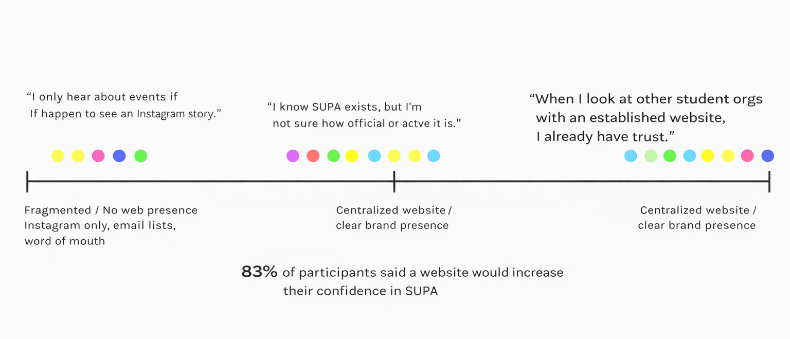
persona spectrum with quotes from user interviews
talking to SUPA members
Next, I conducted expert interviews with 11 core members with leadership position at SUPA.
Assumption/Research Question: What organizational challenges does SUPA face without a dedicated website, and what goals should the digital presence serve?
Findings:
- Thinks that inconsistent branding across communication channels makes SUPA less recognizable and professional
- It's harder when reaching students who aren't already engaged through email lists or social media
user persona
To determine what SUPA's website needed to serve psychology students effectively, I synthesized current challenges SUPA leadership and students face to stay informed and connected and developed a user profile to guide the website's design.

initial wireframe sketches
I prioritized features that would address the core needs identified: a prominent event calendar for centralized announcements, intuitive navigation to resources, clear pathways for peer & advisor directory, and consistent branding throughout.

main screen & logo designs
designed medium fidelity main screens in Figma
SUPA's brand identity
I chose burgundy to be the primary color to communicate Stanford's cardinal red, as well as light beige and vibrant yellow. This is meant to create visual connection to the university while the brain icon establishes immediate recognition as a psychology organization.


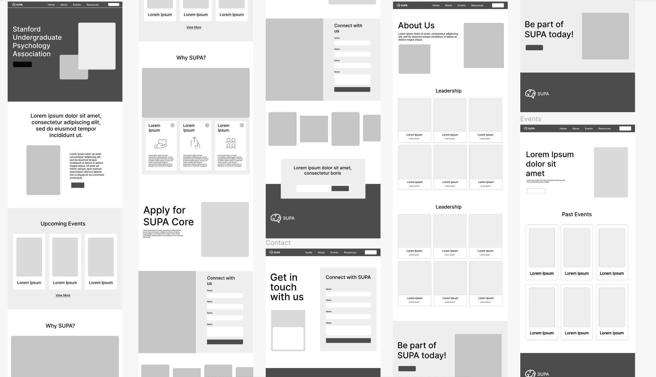
hi-fi prototypes in Figma
Homepage: central hub showcasing all organizational goals and outreach initiatives
About Us: leadership board ("SUPA Core") directory with contact information
Events: consolidated page of all SUPA current and past activities
Resources: two-part section featuring a
People page: featuring faculty, research coordinators, and staff members in department of psychology
Research page: highlighting undergraduate psychology related research opportunities
Contact: dedicated communication portal for inquiries and engagement

high fidelity
FRONT-END IMPLEMENTATION
bringing it to life with HTML/CSS
I used HTML/CSS to implement a functional website, as well as CSS tailwind to create animations for liveliness and engagement.
View github repo →